1
2
3
4
5
6
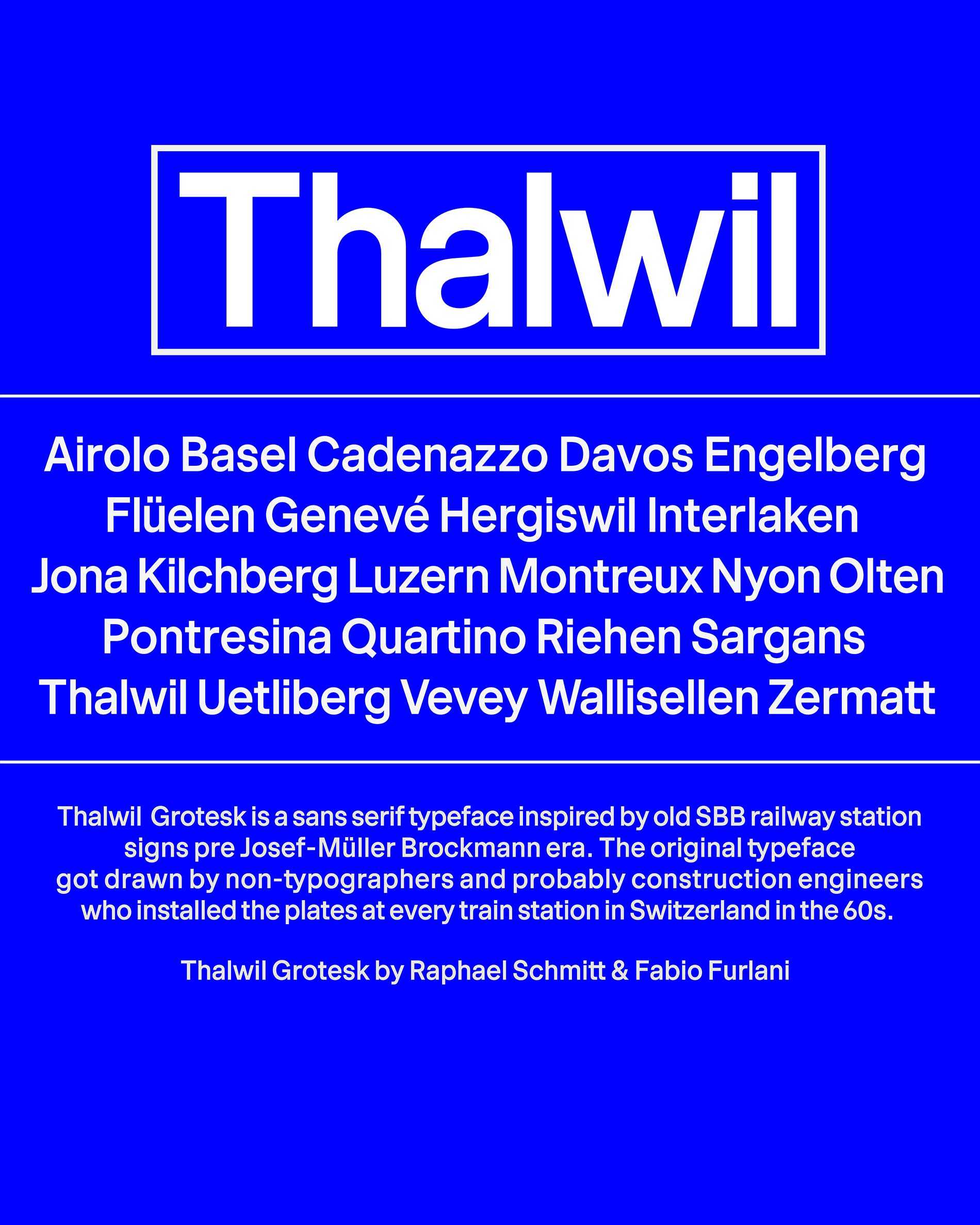
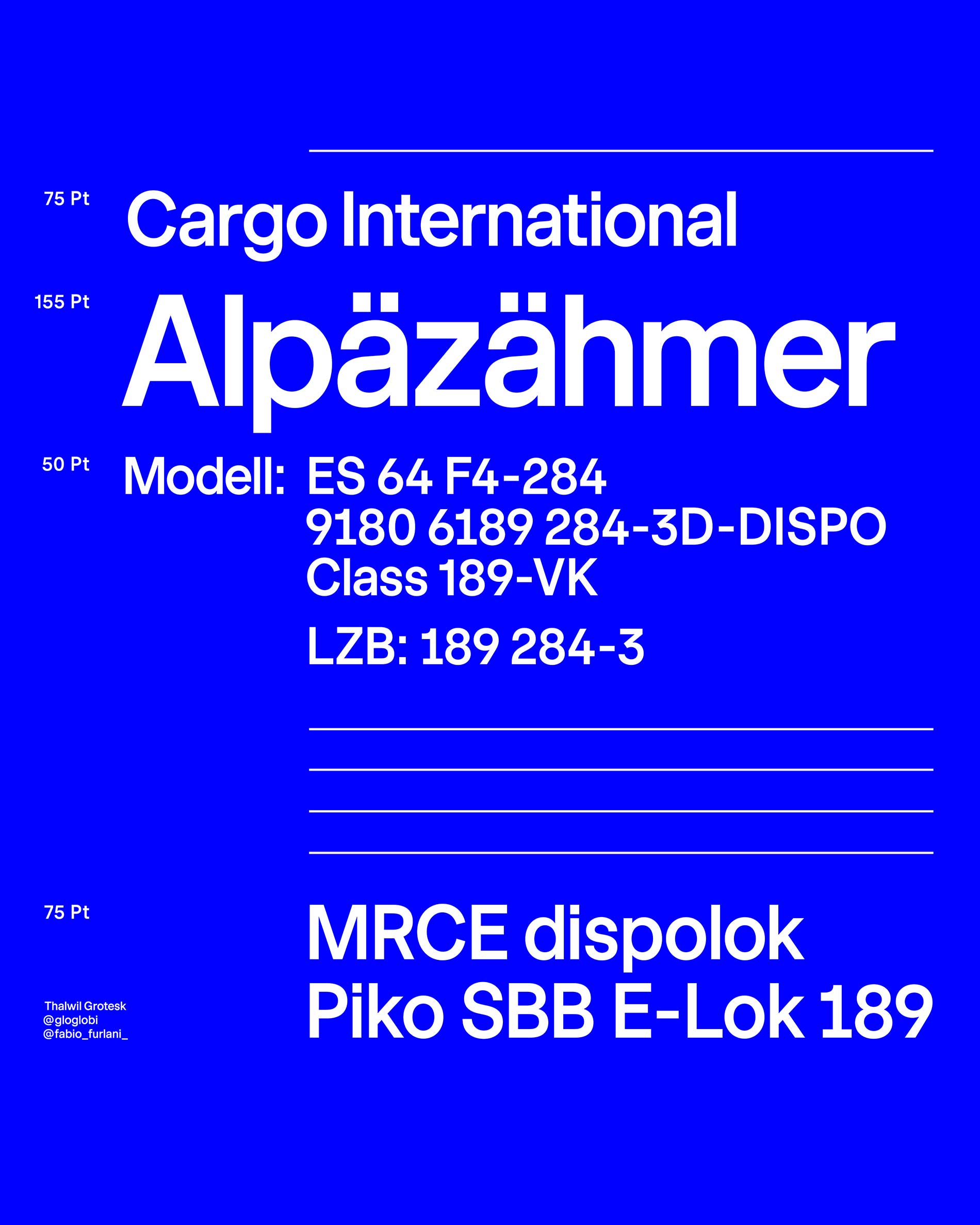
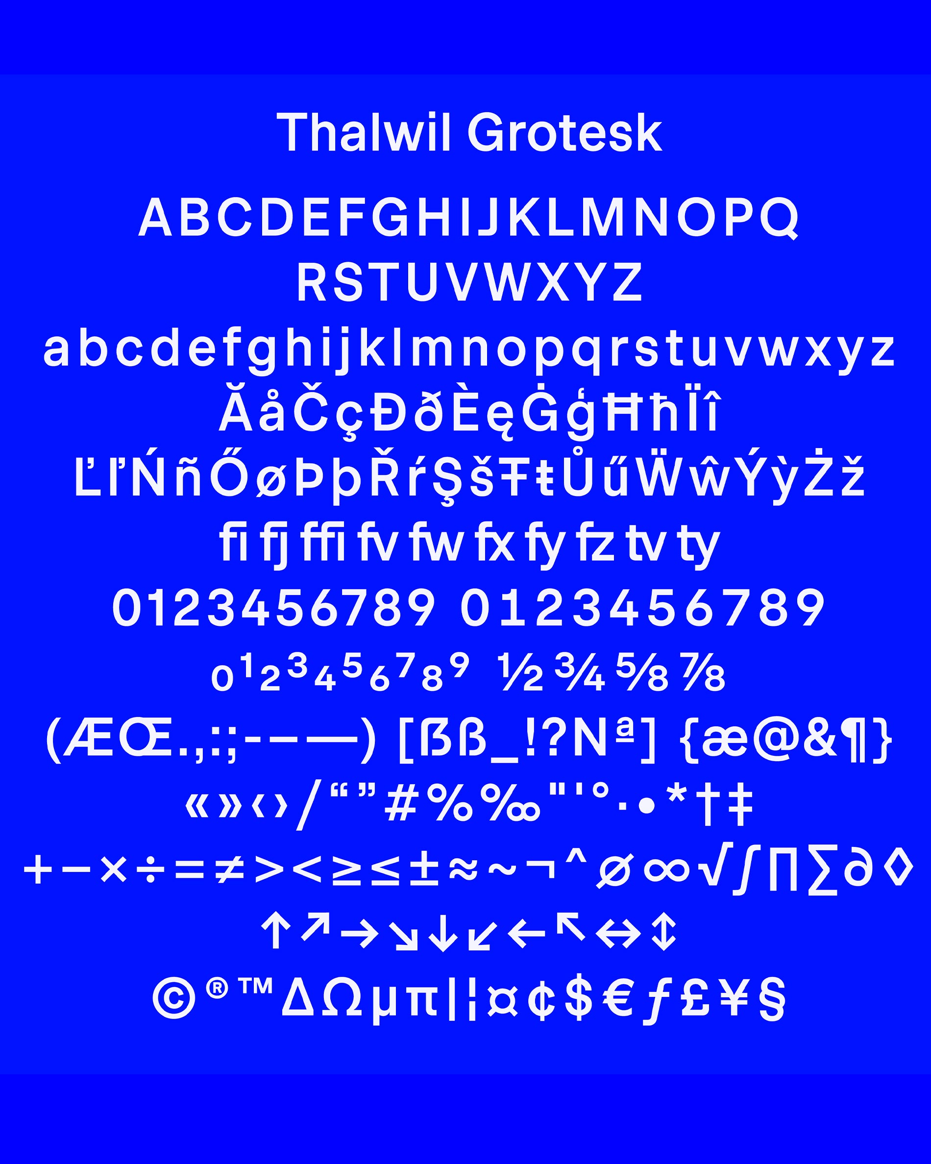
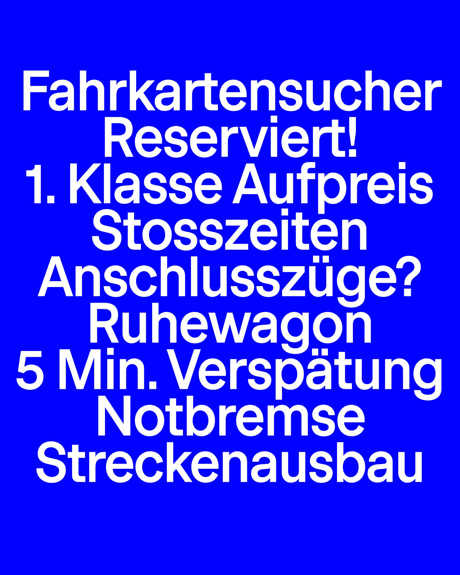
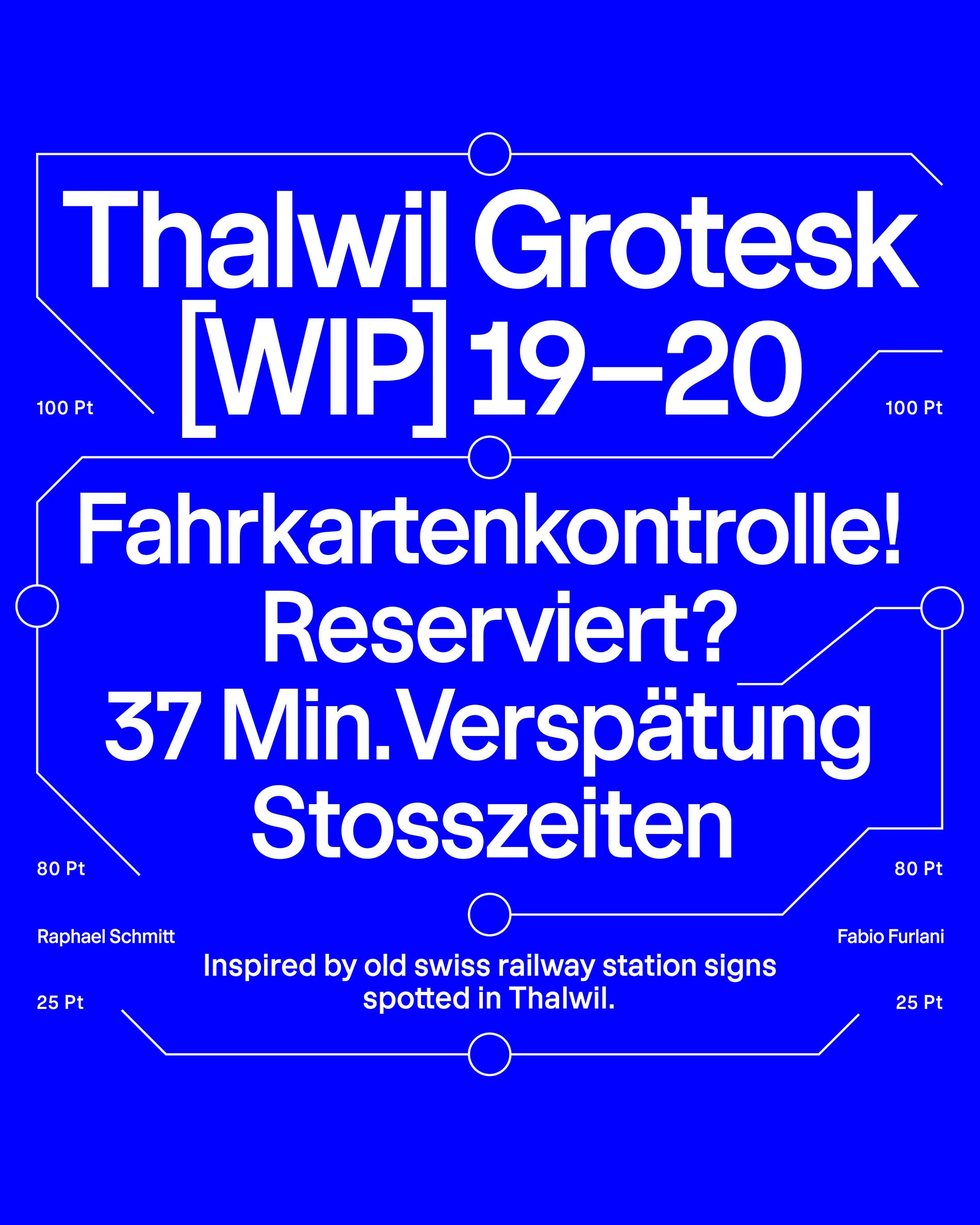
Thalwil Grotesk is a sans serif typeface inspired by old swiss railway station signs pre Josef-Müller Brockmann era. The original typeface got drawn by non-typographers and probably construction engineers who installed the plates at every train station in Switzerland in the 60s. Thalwil Grotesk has a high x-height and is drawn very narrowly. The ascending and descending lines are rather short but longer than on the original. It is very legible in small sizes is optically optimized in horizontal and vertical alignments. Additionally, the stems are manually optimized. Fabio Furlani fixed the original draft and mastered it to perfection with these details when he approached me during quarantine to finalize the project. While traveling from Lucerne to Zurich every day, I spotted the typeface on the plate in Thalwil. I was doing research for quite some time, to find out which typeface is printed on the old plates. After researching I came to the conclusion that the typeface isn’t available anymore in any form and I began to redesign the typeface in November 2019.